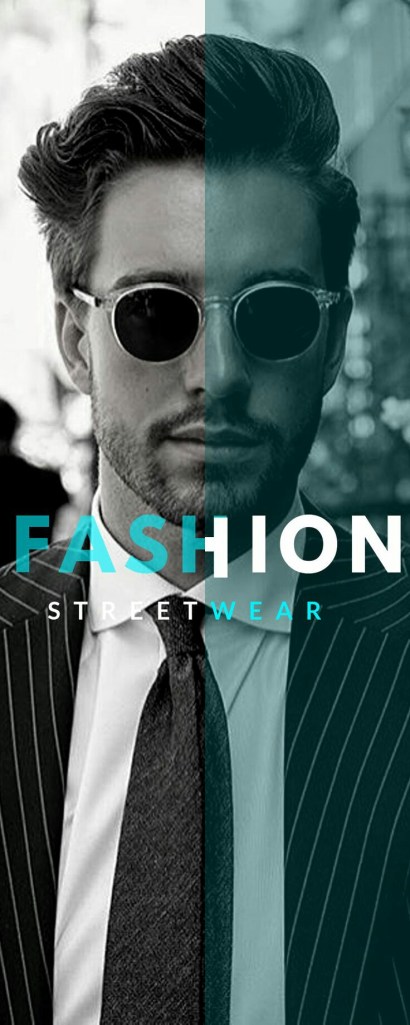
⬤ Men’s Colour Matching Fashion Guide
How to match colors for men’s clothing
⬤ Color Wheel :
Understanding color to better assist a man’s outfit.
The most expensive clothes in the world will not look good if they’re not matching.
Proper color coordination can help your outfit glow if it’s boring, or tone it down a bit if it’s too loud. Below are the basics about color coordination, as well as tips for putting them together to help your ensemble.
Below are the basics about color coordination, as well as tips for putting them together to help your ensemble.
❖ Introduction : The Color Wheel And Color Basics
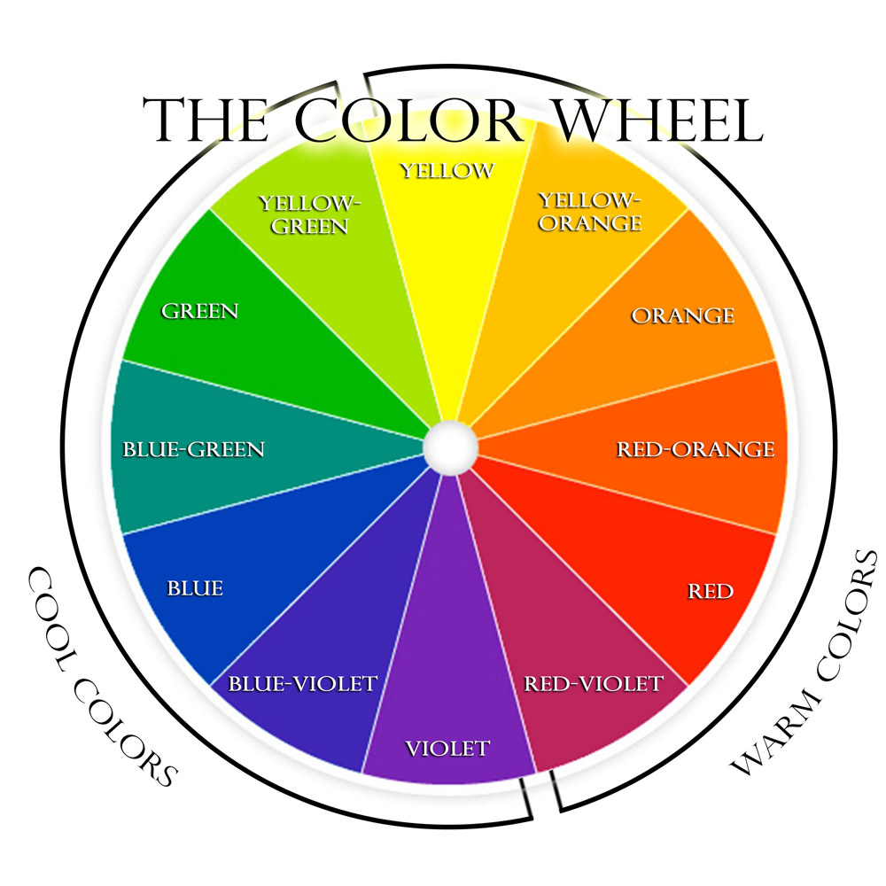
The color wheel which was developed by Sir Isaac Newton in 1666 – is the basis for all color theroy.
Color coordination should never be overlooked by the man building a wardrobe. Wearing the right colors is just as important in an outfit as proper fit as colors have to ability to make or break an outfit. They can make a man look bland and boring or they can make a man look loud and foolish.
With this in mind, finding a happy medium is essential to developing the look men strive for. By looking at the basics of color and how to incorporate these basics into an outfit we will be able to confidently develop the knowledge necessary to match our clothes properly, allowing us to look our best whether in a custom suit or jeans and shirt.
Adding a little bit of white to any of these colors will make them a tint lighter, while adding a little bit of black will make them a tint darker. In theory, all of these colors are connected, so coordinating them works, but knowing how to do that properly is essential.
The 12 colors are called ‘hues’.the closer the colors are to each other, the easier they are to coordinate. For example, wearing a blue dress shirt with a tie that has blue-green strips is a good, simple coordination. On the other hand, trying to mix yellow-green and red-violet can get messy, so knowing how to mix these colors is important.
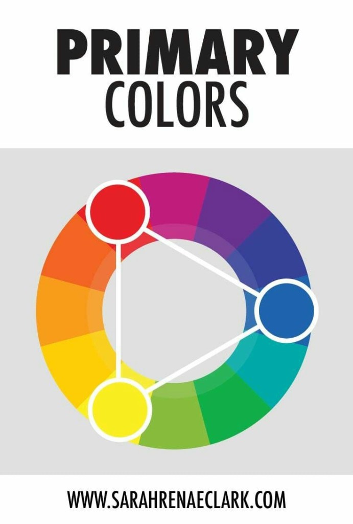
⬤ Primary Colours :
■ Red
■ Yellow
■ Blue
Red, yellow and blue are the only colours that cannot be made by mixing any other colours together. They are the strongest hues and without tinting or shading, they come across very harsh on the eye. As they are bright and intense, they are eye-catching – and not always in a good way.
On the shelves of a more eccentric shop, you can find a bright red suit, a yellow trench coat or a striking blue leather jacket. You don’t always have to buy it! If you are a big time fan of pure red, yellow or blue, use these colours for details or smaller clothing pieces. For instance, choose something that small accents of the unaltered primary colours: a bowtie, a scarf, or a pocket square.
If you do end up purchasing a bold piece of clothing that contains any of these colours, pump up your confidence and allure and don’t let it wear you. A bold blue blazer can be an amazing item and so can a vivid yellow pair of shoes worn on a summer day
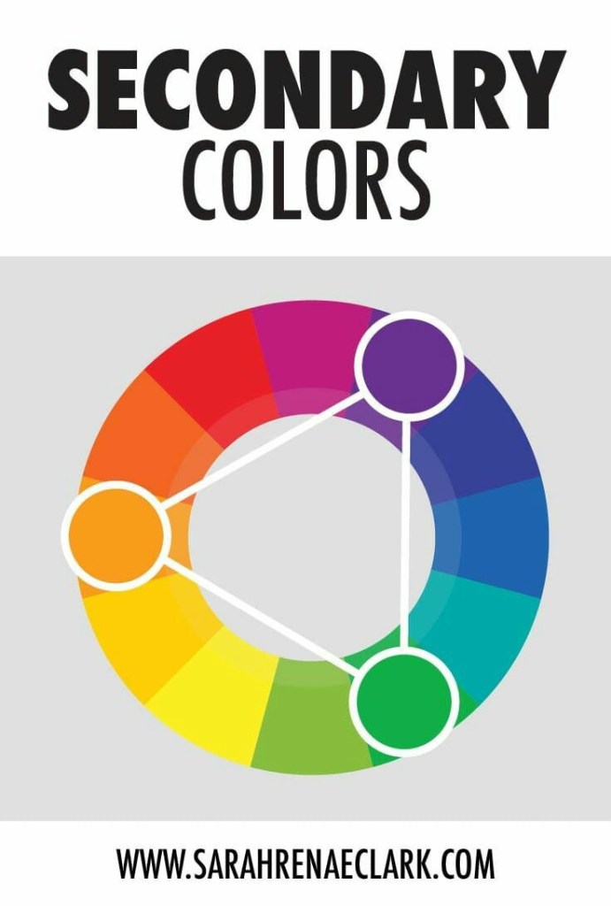
⬤ Secondary Colours :
■ Green
■ Orange
■ Voilet
Each of the three secondary colours is the result of combining two primary hues. Yellow mixed with blue becomes green, red mixed with yellow becomes orange, and red mixed with blue becomes violet. The secondary hues are direct opposites of the primary ones, therefore, they are complementary colours.
A combination of complementary colours usually pops up and is very much noticeable. The eye notices a complementary outfit even better than it notices patterns, for instance. A common mistake is combining two large complementary clothing pieces thinking they will complement each other. A pair of blue trousers won’t look good if matched with an orange jacket, in the same way, a pair of red shoes won’t save green suit.
The best way of using the power of complementary colours is to develop an eye for details. For example, match a green pair of shoes to red shoe laces. If you have a blue blazer, get an orange pocket square, or purchase a violet shirt with yellow buttons. All these options might sound too adventurous but if you keep the rest of the outfit plain, it will work wonders, and you’ll get noticed in the best way possible.
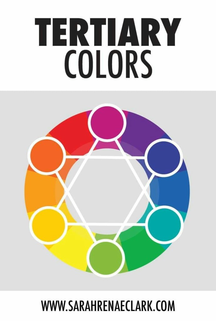
⬤ Intermediate Colours :
■ Red-Violet
■ Red-Orange
■ Yellow-Orange
■ Yellow-Green
■ Blue-Green
■ Blue-Violet
This is where you actually need to pay attention. The key to improving your style is knowing your intermediate colours, also known as tertiary. These hues are not tints or shades of the primary and secondary hues, but colours in their own right. And if you really think about it: are you more likely to buy yellow or yellow-orange trousers? Are you ever going to purchase a violet jacket or will you rather go for blue-violet.
Because some of these hues are not as strong as their brighter sisters, are easier to incorporate into your wardrobe and pull them off with no effort. Knowing the tertiary hues will also teach you what to stay away from yellow-green and red-orange.
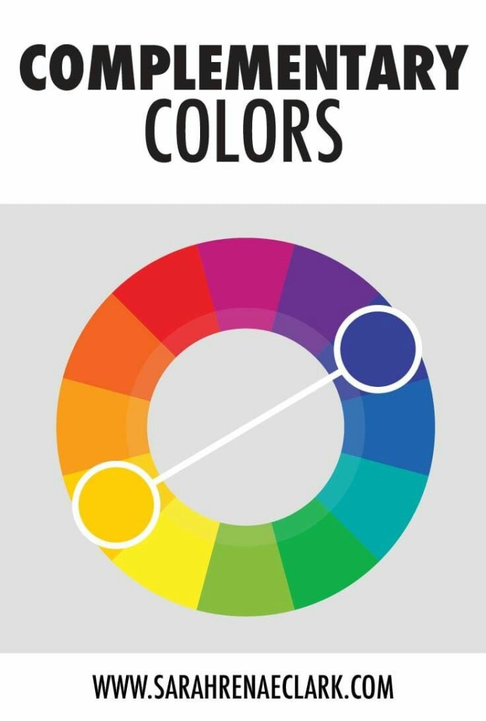
⬤ Complementry Colours :
These colours are directly opposite of each other on the colour wheel. They create a bold contrast and are catchy. As mentioned above, the best way to complement colours is by having a dominant clothing piece in one colour and smaller details or accessories in the other.
On the colour wheel, any three equidistant colours can form a triad scheme. Visually, this creates the most balanced form of contrast. The triad scheme is best when you intend to layer your outfit, wear a three-piece suit, or when you enjoy wearing a few accessories and want to keep a pleasant balance.
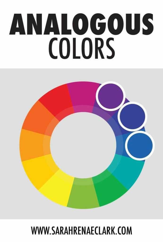
⬤ Analogous Colours :
The analogous colours are placed directly adjacent on the wheel of colours. This creates a safe, minimal contrast perfect for when your clothes are of similar colours. This scheme is most useful for a fancy-formalwear combination where guests are not restricted by a black tie attire.
Mens Colour Combinations
All the above are great, and work really well in general when you are trying to think of what colours work well with what. However, there are specific mens clothing colour combinations that work well for men in particular.
➣ MATCHING CLOTHING COLOURS – PAY ATTENTION TO YOUR SKIN TONE
While the ‘rules’ of colour combining apply, for the most part, across the board, an individual’s colouring can have an influence on how well certain colours combine when it comes to their outfit.
By experimenting with wearing different colours, you’ll soon learn what ones suit your skin tone, and, conversely, what ones visually wash you out. As a general rule of thumb, darker skin tones, which have a tendency to make those with paler skin appear ‘washed out’, tend to work well with brighter, warmer colours.
Those with a paler complexion, meanwhile, often suit shades such as grey, navy blue and burgundy.
It’s very important to know which colour combination suits your personality and skin tone too. For some outfit layering and styling becomes complicated because they lack the knowledge of colour combinations. Too many colours in this fashion world but choosing the right ones is a tough job.
Sometimes it’s very important to maintain good colour combination to flaunt your style as a wrong one can break it instantly. If you are looking for a blog that can help you with right colour combination tips and guide you through the styling process you have landed on the right blog.
➤Here Are Some Outfit Colour Combination Tips & Rules Men Should Follow:☟☟
I. Light colour bottom should be styled with dark top and shoes.
II. Avoid top wear colour that is close to your skin tone. As it may seem washed out and pale.
III. Avoid wearing three pieces with similar colour shades as this would definitely break your look.
IV. Know the outfit patterns and go for the colour combination accordingly.
V. Dark blue and brown is a classic colour combination which never goes wrong.
VI. Grey with blue denim for a casual look is clever option.
VII. For formal look dark colours like black, charcoal grey or burgundy will do wonders.
VIII. Mustard or beige colour looks amazing with different shades of blue.
IX. Going for bold colours like orange, yellow or green be very careful as it shouldn’t look weird.
X. Bright colours look stunning during summers.
XI. Men should surely invest grey outfit in his wardrobe as it plays a great role in colour combinations.
XII. Wine colour with black or brown gives men elegant look effortlessly.
XIII. Choosing red for suits, blazers or coats is striking.
XIV. Beige and royal blue definitely makes men stand out in crowd.
XV. Black and white is the all-time favourite colour combination of many.
XVI. Dark green colour with light colour bottom wear looks amazing.
XVII. Grey with bright colour like red or orange is a great colour combination.
XVIII. Don’t go for too many colours while styling.
XIX. Pink, blue, beige, purple and burgundy top wear goes well with black bottom.
XX. Make sure the printed outfit too has good colour combination in its design while buying.
◆ Colors can really enhance your personality when used correctly. Before we discuss best color combos for men’s dress, here are some rules to note: ✍
❒ Brighter, lighter colors make you look larger.
❒ Dark colors make you look smaller and slimmer.
❒ Navy blue, black and grey are formal and authoritative.
❒ To look taller, wear single color outfit
Light shirts go with dark pants and vice a versa.
❒ For men with fair skin tones, it is best to avoid bright shades like orange and yellow.
❒ Men with medium/brown skin tone must avoid too dark or too light shades.
❒ Dress color combination for dark skin: avoid too bright and too dark shades.
☛ we picked out most stylish colour combinations which work for all occasions.
◈ Mens Formal Wear Combinations :
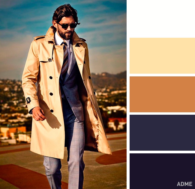
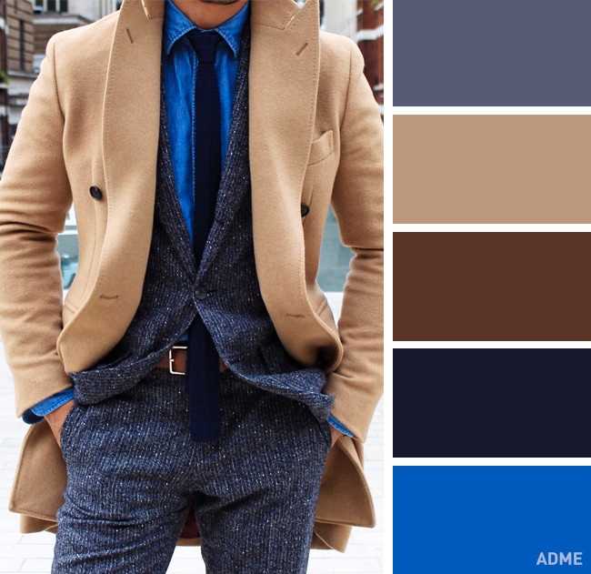
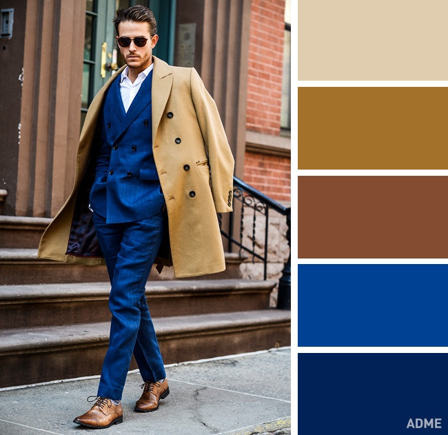
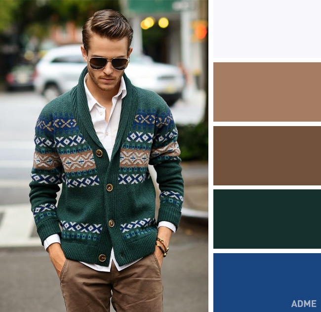
One of the best colours to go for when you are looking for a smart look is camel. Camels and browns go exceptionally well with blues and burgundies to make a very chic outfit.
◈ Mens Casual Wear Combinations :
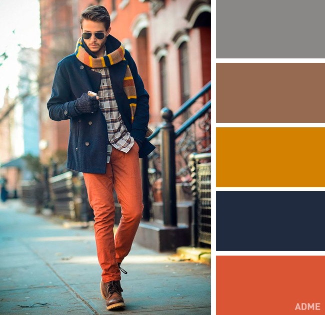
With casual colours we delve into the realm of excitement. Here we can start adding in bright colours such as oranges and greens. Great for summer try wearing your blue jean shorts, with a orange tee and white trainers, this sounds simple but you’ll see how much the colours pop and compliment each other.
Best Color Combinations For Men’s Clothing :
Nowadays, this is as true for men as it is for women, and getting it right can sometimes be just as complicated.
— it helps to introduce both variety and individuality to your wardrobe.
Navy and White
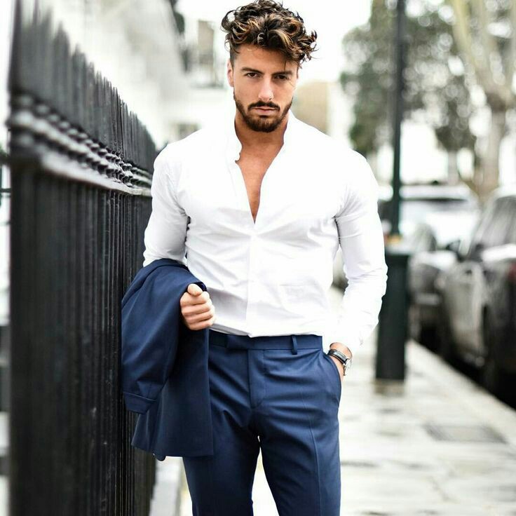
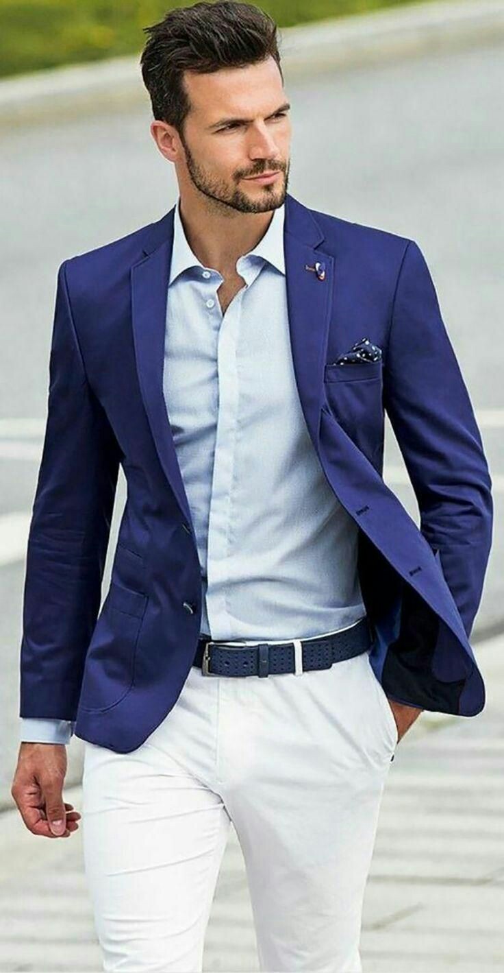
Navy and white is men’s color matching at its finest. The contrast between navy and white is super pronounced, giving both colors space to pop. More so, it is a classic combo, invoking things like sailing style.
Style this look by pairing white jeans with a dark denim shirt or navy button down. The reverse of navy chinos and a crisp white oxford is a timeless look as well.
Grey and Black
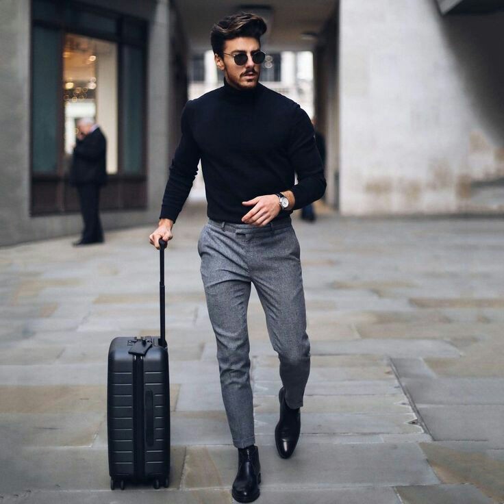
Grey and black is an (almost) criminally underused color combination. The subtle variation from grey to black creates contrast while at the same time being muted. The tint in darker greys is reflected in whatever piece of black clothing you are wearing. Ultimately, you capitalize j both the contrast and the complementary nature of the colors.
Wear this look with a pair of heather grey chinos and a black t-shirt or reverse it with a dark grey polo shirt and some black jeans.
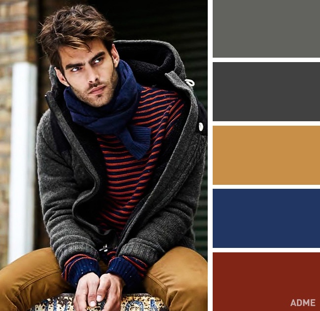
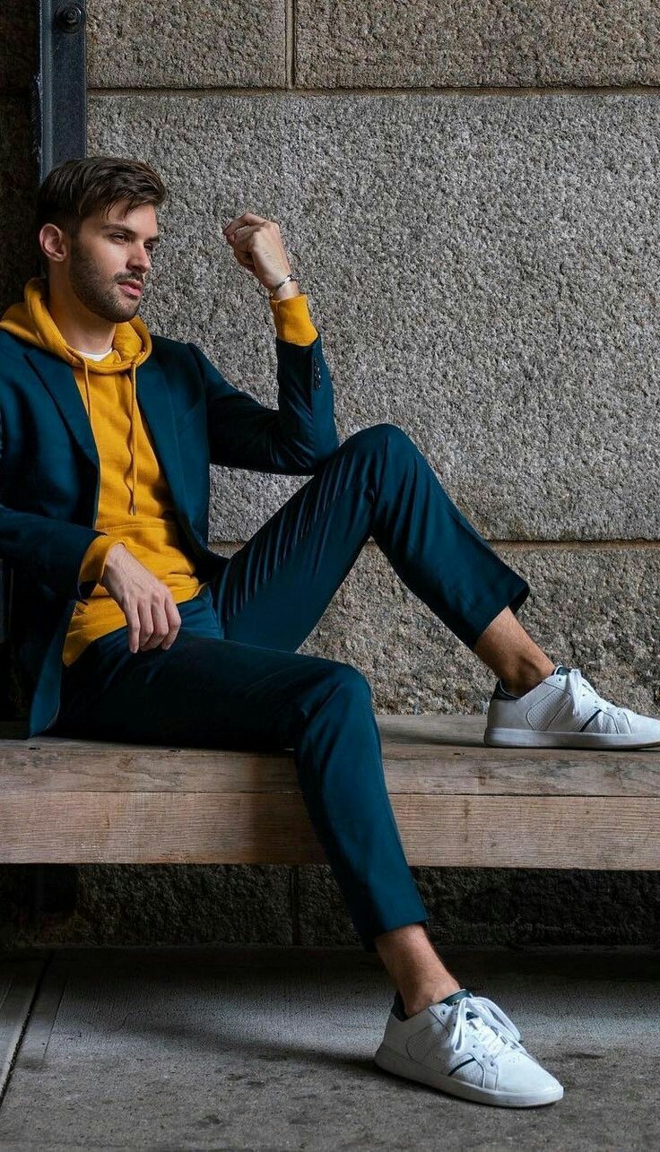
Green and Khaki
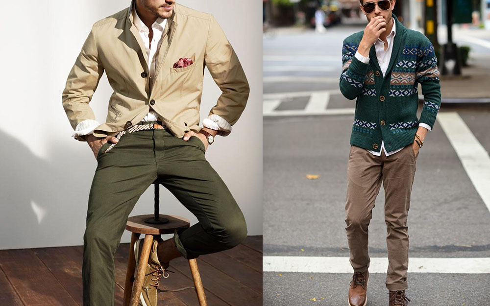
Military wear is a heavyweight for influence in menswear. It’s obvious then that the military combo of green and khaki is one of the best color combinations a man can rock (i.e camouflage). Furthermore, the color match of green and khaki just gives off woodland vibes. So maybe you’re more into tents than you are into tanks. That works, too.
Brown and Cream
Have you been smoking Cubans, or chilling on a pool deck in Manila? We love the laidback magnate look of brown on tan on lighter tan on tan on tan. Go for it.
Grey and Pink
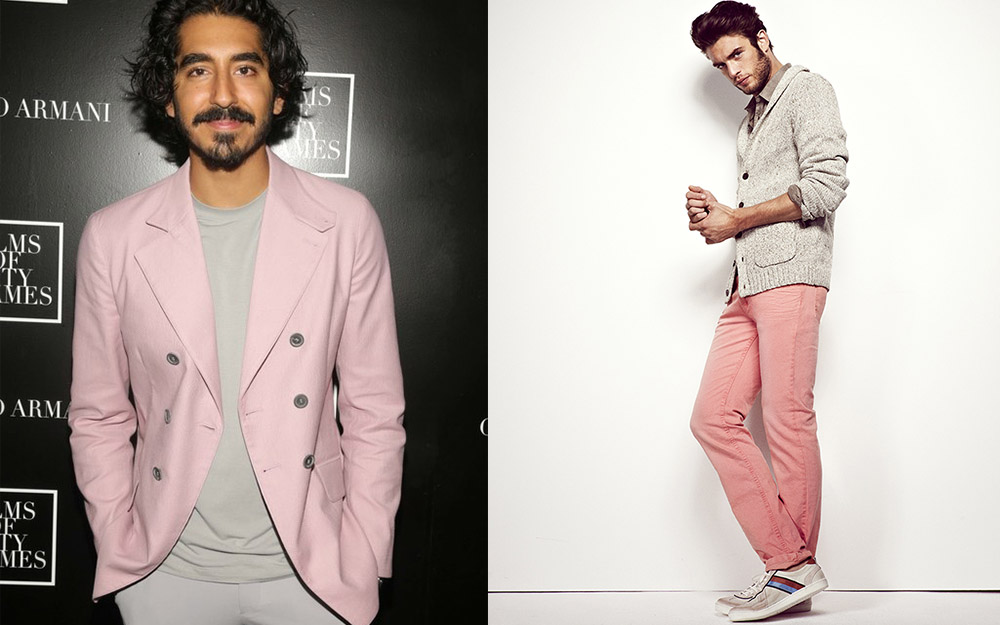
Low-key sensitive and edgy. That’s what grey and pink say for you. Grey has a muted, understated tone, while pale pink adds the spice of something unexpected. This is a modern color combination, but we believe it will be a classic in no time.
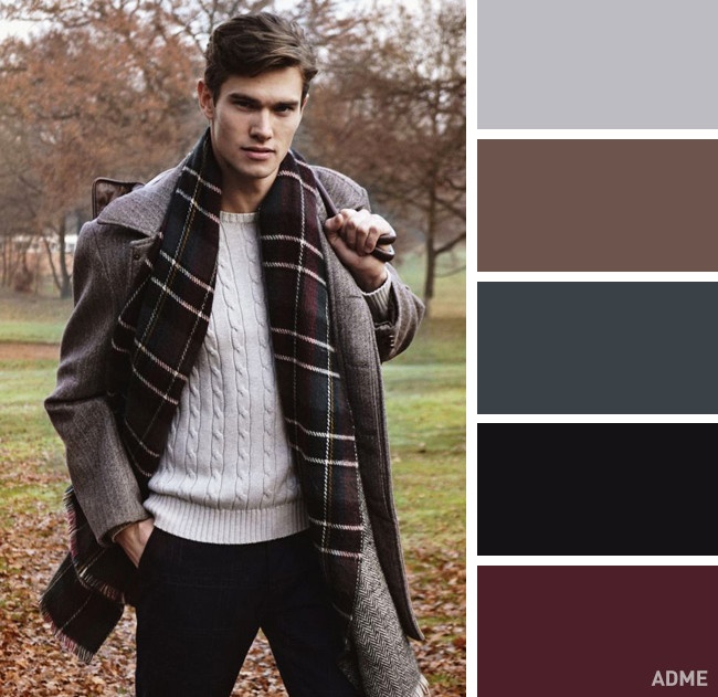
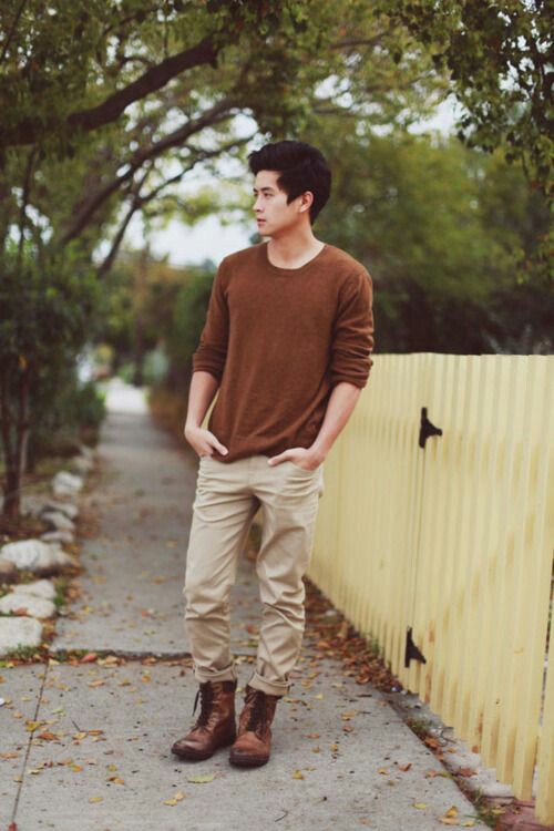
Brown and Burgundy
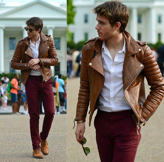
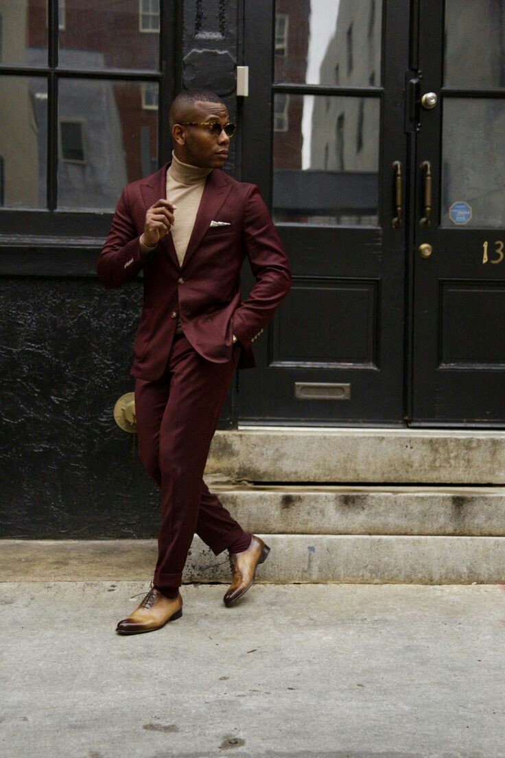
Give off scholarly vibes. Not the nerdy professor, but the well-read tenured man who’s lived in Morocco and sips on Johnny Walker Blue. Dark, deep red mixed with brown is a passionate and rich combination.
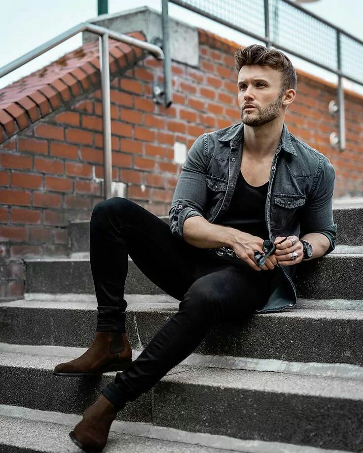
Black and White
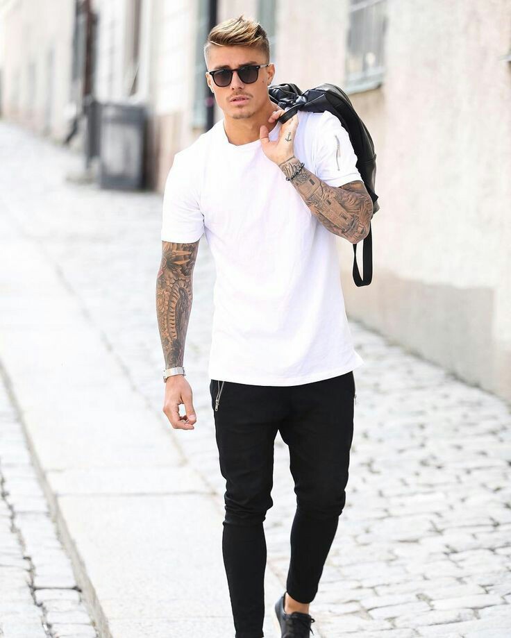

The all-time classic. You literally can not go wrong with pairing black and white. No one will tell you it’s a weird color combination. In fact, the high contrast gives a clean and elegant look. The one addendum is that black and white can be somewhat formal, depending on how you wear it. That’s why Black-Tie and White-Tie events are the dressiest.
Wearing Yellow
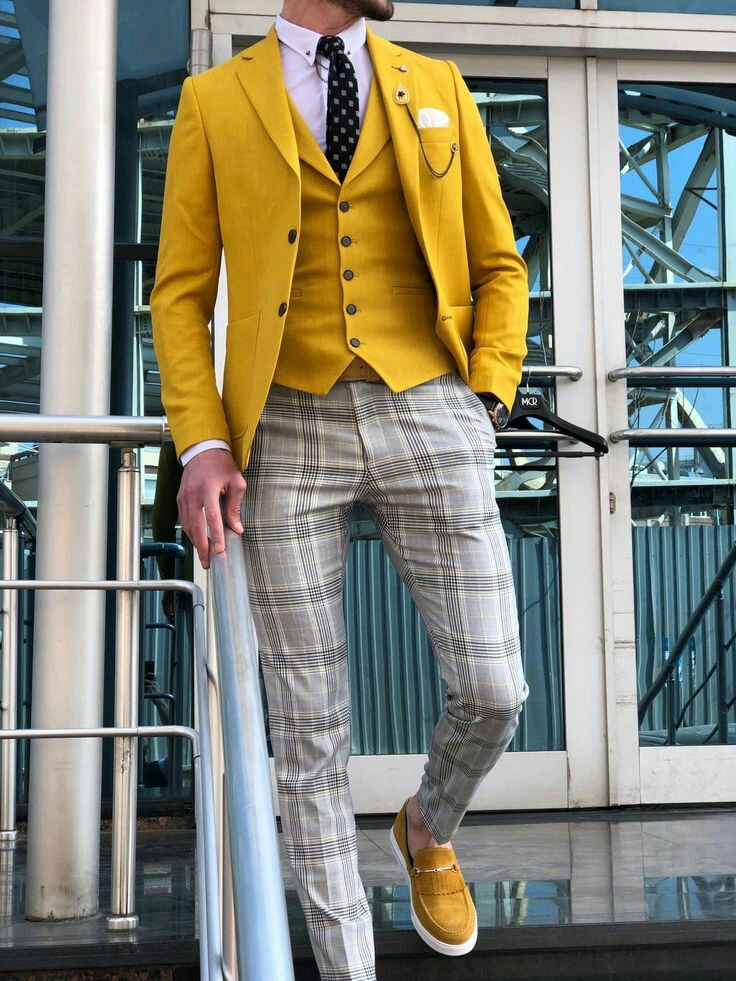
We like euphemisms. Instead of a pre-2005 car being considered “old,” we’d like to say it has character. Likewise, we like toning down yellow with a shade called “mustard.” Adding a pop of mustard adds life to your outfit without drowning it out in the audaciousness of a brighter yellow.
Mustard goes well with darker clothes, for a slightly alternative, slightly grunge feel.
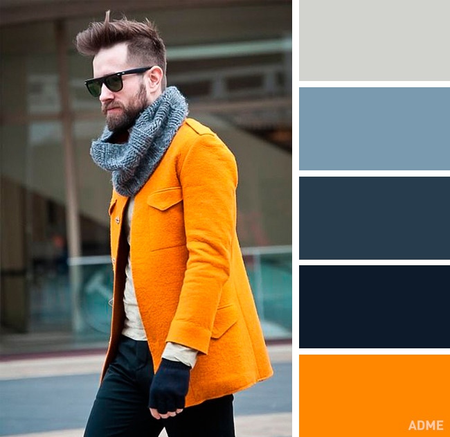
Wearing Orange
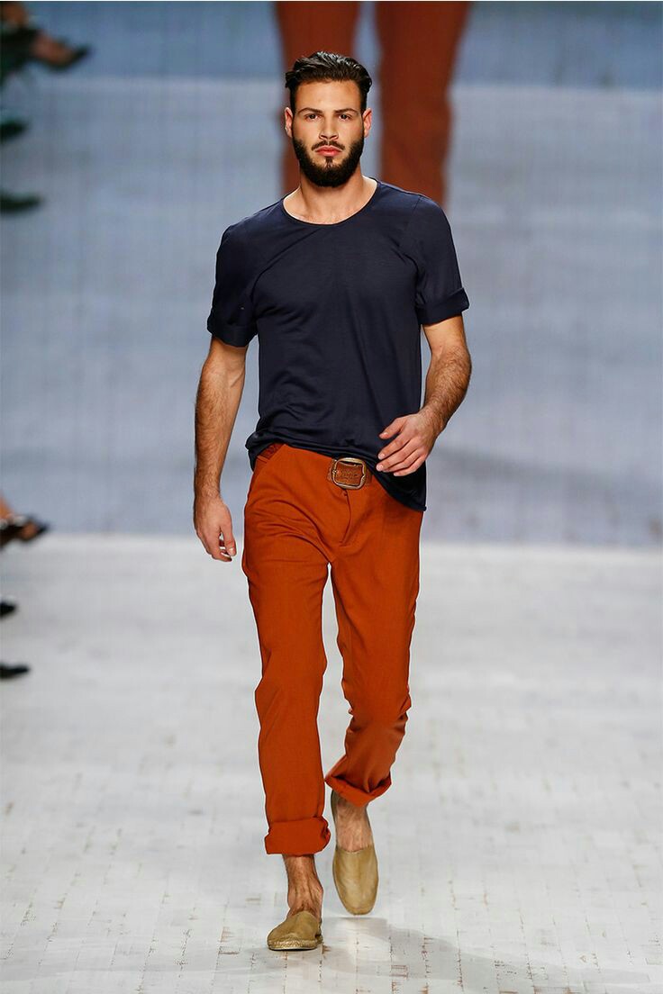
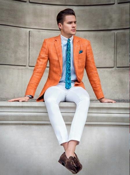
Same goes for orange. Orange is notoriously difficult. Besides not rhyming with anything, actually wearing it is even harder. Orange is a bold color and demands attention. That doesn’t mean that you should hide from it though. It can be pulled off by choosing a more muted shade like “rust.” Just make sure that you let that color shine and keep the rest of the look less pronounced.
Pair rust with darker colors and neutral solids.
Read More